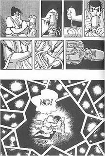
From TIME Online Magazine Comix review: "This counterpoint of seriousness and play manifests itself most fundamentally in the artwork. The characters appear mostly in a silly 'cartoon' style, with tropes like exaggerated brows, buckteeth and expressive eyes. (Tezuka defies expectations of what Japanese 'manga' looks like.) These caricatures are then set against highly detailed backgrounds, with Tezuka often taking extra panels, or even entire two-page spreads, just to linger on the environments. He has such a mastery of the form that while providing every necessary panel to tell the story he has extra space just for breathing room."


0 comments:
Post a Comment